Quiz: Is Your Website Helping or Hurting Your Fundraising?
Anne Stefanyk, Guest Blogger
This guest article was written and submitted by Anne Stefanyk, Founder and CEO of Kanopi Studios. Please see the end of this article for Anne's bio.
 By: Anne Stefanyk
Your website serves as many potential donors and new members’ first impression of your organization, acting as a “gallery” that visitors can explore to learn about your mission and fundraising efforts. Before they commit to a gift, they visit your site to understand your museum's mission, see its impact, and learn how to make a contribution. This digital front door can either welcome them in or turn them away.
So, how can you determine whether your museum’s website makes a stellar impression? Answer the questions below to assess whether your online presence is helping or hurting your development goals. Keep track of your answers as you go and review best practices along the way to improve your results.
How quickly can a visitor understand your museum's mission?
A) Instantly. Our mission and a "Support Us" link are clear on the homepage, showing what we do and why it matters.
B) It takes some digging. They might have to click on "About Us" or scroll through a lot of text to find our core purpose.
▶️Pro tip: Conduct user testing to determine whether your website clearly explains your mission. Ask a volunteer who is unfamiliar with your mission to browse through your website to find information about what you do and why you do it. Track how long it takes for them to locate the information, and ask for their feedback afterward to see if they encountered any problems or conflicting information.
Is your "Donate" button easy to find?
A) Yes, it's a prominent button with contrasting colors, visible in the main navigation on every single page.
B) No, it's a text link in the footer, or it's buried in a "Get Involved" dropdown menu.
▶️Pro tip: Museums can learn valuable lessons from their fellow fundraisers at charitable nonprofits. For example, Kanopi Studios’ nonprofit web design guide highlights the charity:water website as a particularly effective example of an easy-to-use online donation process. The website prominently features its donation form on the homepage, accompanied by a top-level menu button that utilizes eye-catching colors.
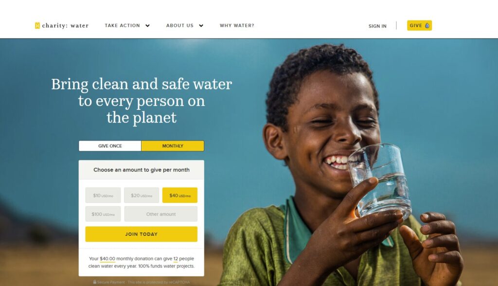
Alt: A screenshot of the charity:water online donation form
How many clicks does it take to complete a donation?
A) Very few. We've streamlined the process to two or three steps, and the form is simple and intuitive.
B) Many. We request a significant amount of information, and the user must navigate multiple pages to finalize their gift.
▶️Pro tip: Don’t try to capture every bit of supporter information you can with your donation form. Just stick to the essentials, such as donors’ names, contact information, and payment details. Bloomerang Fundraising’s donation page guide recommends using email newsletters and periodic surveys if you want to gather additional information in follow-up communications.
Does your donation form inspire confidence?
A) Yes. It's clean, branded to our museum, and clearly shows security seals. It also suggests specific impact-based giving levels, like "$50 funds one school group tour."
B) Not really. It's a generic, embedded form that feels disconnected from our brand, or it looks outdated and cluttered.
▶️Pro tip: When it comes to fundraising, perception is reality. A professional, updated, clean donation form goes a long way toward reassuring donors that they can trust you to handle their gifts responsibly.
Do you show donors where their money goes?
A) Absolutely. We have a dedicated "Impact" page, annual reports, or stories that clearly demonstrate how contributions support new exhibits, conservation, or community programs.
B) We don't. We assume people know their donation helps, but we don't provide concrete examples or financial transparency.
▶️Pro tip: Impact information doesn’t just inspire donors to give one time. It can foster a sense of camaraderie within your community, making supporters feel like true partners in achieving your museum’s mission and encouraging donor retention. Focus on telling stories about how your museum brings people together and strengthens your community.
Is your site content current and professional?
A) Yes. We regularly update our exhibit information, event calendars, and staff lists. The site is free of typos and broken links.
B) No. The "Latest News" section contains information that is at least two years old, and visitors often encounter outdated content or 404 error pages.
▶️Pro tip: Keeping your site current involves more than just updating content. To ensure your site remains relevant and performs well, stay up-to-date with your website builder updates. Your site should use the latest version of your website platform, whether you use WordPress, Drupal, or another content management system (CMS). Providing your site with a strong foundation ensures that you won’t have to worry about technical issues when making content changes.
Does your website seamlessly integrate with your fundraising tools?
A) Yes. Our site integrates with our other digital solutions, including our museum software that we use to manage operations, constituent relationship management platform (CRM), and accounting tool.
B) No. Our website donation form is a standalone tool, and we have to manually enter donor data into our other systems.
▶️Pro tip: A donation is the start of a relationship, not just a transaction. When your website form doesn't automatically "talk" to your CRM or donor database, your team is forced to move data manually. This poses a significant risk of typos and delays in thanking your supporters.
True integration means a new online gift instantly updates the correct supporter record. This allows for immediate, personalized acknowledgment and gives your team a 360-degree view of that donor, connecting their gift to their membership, event attendance, and past support.
How does your donation page look on a smartphone?
A) Great. The text is readable, the buttons are large and easy to tap, and the form fields are simple to fill out on a small screen.
B) It's a problem. Visitors have to "pinch and zoom" to read, the navigation is tiny, and the form is difficult to use.
▶️Pro tip: Design for the smallest screen first. This forces you to prioritize mobile-friendliness in your online fundraising strategy. Ask yourself: "What is the single most important action a mobile visitor (like a donor) needs to take?" For a museum, options might include "Donate," "Buy Tickets," or "Become a Member." This approach ensures that your most critical calls-to-action (CTAs) are front and center, not hidden three scrolls down or tucked away in a complex menu.
Scoring Your Results
If you answered "Mostly A's": Your Website is a Fundraising Helper
Congratulations! Your website demonstrates a clear commitment to the donor experience. You are building trust, communicating your mission clearly, and making it easy for supporters to donate. Your site is a strong asset that actively supports your development goals.
If you answered "Mostly B's": Your Website is a Fundraising Hurdle
This is a common and fixable problem. Your website is likely creating friction for potential donors. These hurdles—a confusing mission, a hidden donate button, or a challenging mobile experience—can cause supporters to abandon their gift. This is a critical area to address, whether with the help of your in-house marketing team or a skilled external web developer.
Next Steps: Quick Fundraising Fixes for Museum Websites
Your museum's digital presence is a direct line to your supporter community. Consider every hurdle you identified in this quiz as an opportunity for improvement, not a five-alarm fire.
Start by focusing on the highest-impact fixes first:
- Make your "Donate" button prominent, with a contrasting color to the rest of your site, and visible in the main navigation on every single page.
- Simplify your mobile donation form, removing every field that is not absolutely necessary to process the gift.
- Add specific, impact-based giving levels directly to your donation page to connect the gift to a tangible outcome.
- Brand your donation page with your museum's logo and colors to build trust and signal security.
- Update your "Events" or "News" section and fix any broken links; a site that appears dormant is a major red flag for potential donors.
By treating your website as a key member of your development team, you can build trust, enhance the user experience, and create something that brings your community together.
 About the Author: Anne Stefanyk, CEO/Founder, Kanopi Studios
Anne Stefanyk is the Founder and CEO of Kanopi Studios, a leading digital agency that designs and builds websites for mission-driven organizations. With deep expertise in strategy, user experience, and open-source technologies, Anne has guided Kanopi to become a trusted partner to nonprofits, higher education, and healthcare institutions.
Since launching Kanopi in 2010, Anne has fostered a people-first culture and a strong commitment to accessible, sustainable web practices. Her team creates inclusive digital experiences that help organizations make meaningful impact.
Follow Anne:
X
Drupal
LinkedIn